Salford City Destination branding
The Salford brand embraces all the various partners and stakeholders working to improve the image of the city, from the city council and local strategic partnership, to major players in the city such as The Lowry Hotel and Salford University.
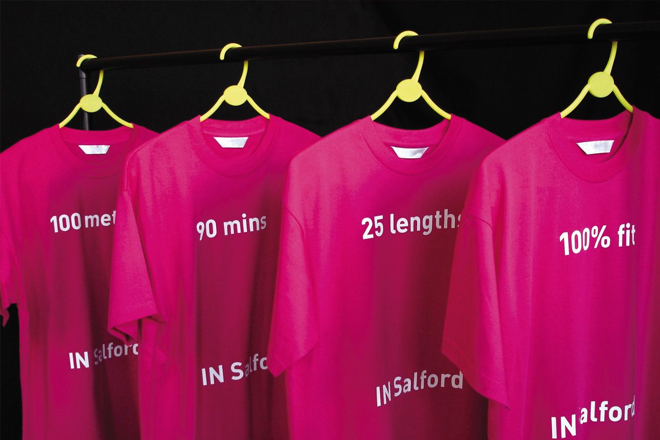
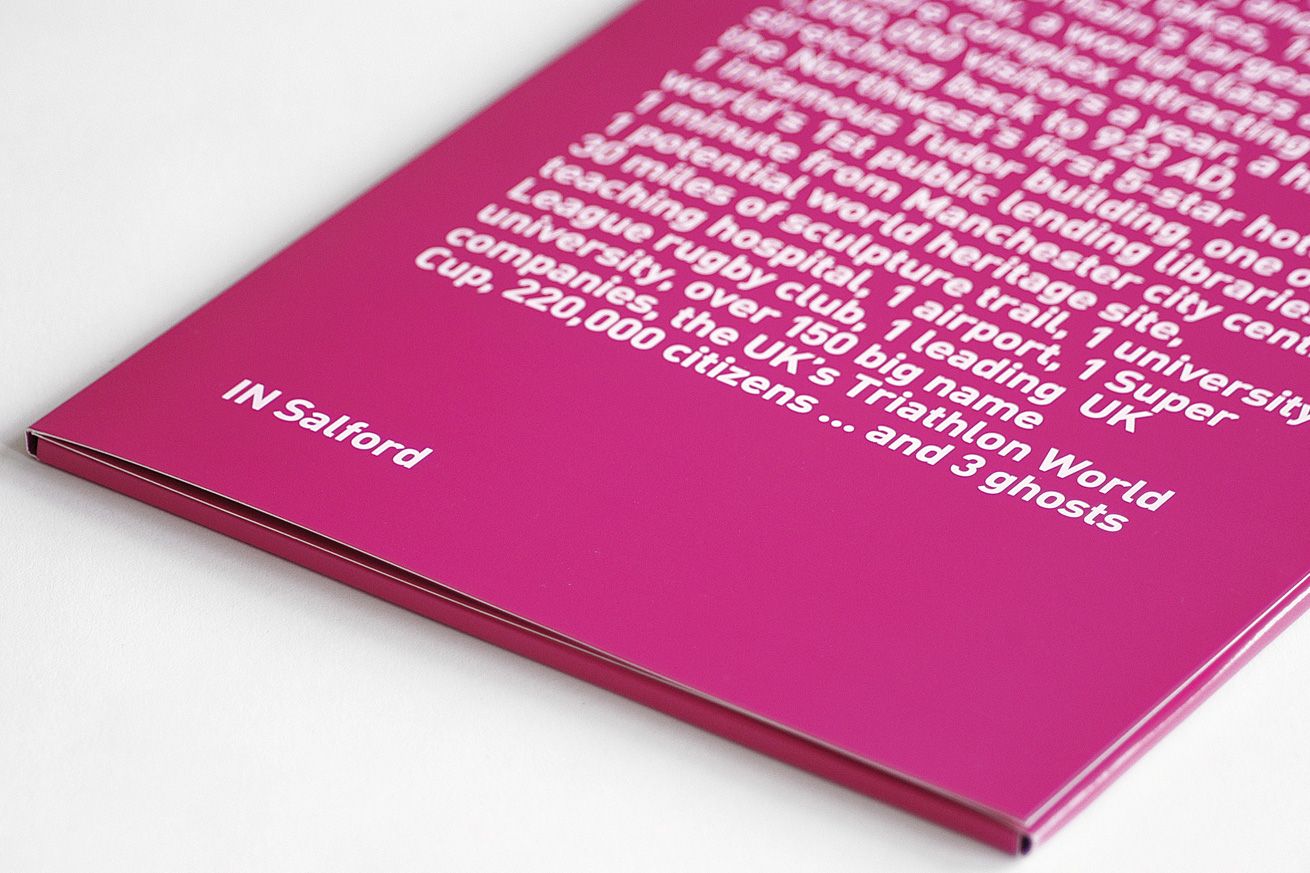
The identity challenges people’s preconceptions of Salford, reflecting a spirit of self-confidence and optimism through a strong, modern and forward-looking visual treatment. It is based around the device ‘IN Salford’, used in conjunction with a range of marketing and ‘doing’ messages, to tell people about services, developments and facilities in a very direct and human way.
Magenta was chosen as a signature colour because it is vibrant, contemporary and highly visible on the streets—and it is sufficiently arresting to force people to rethink their view of Salford.
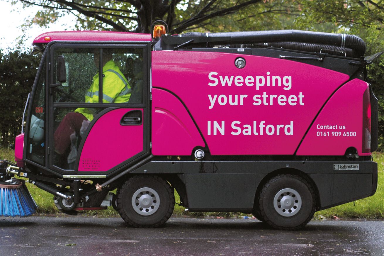
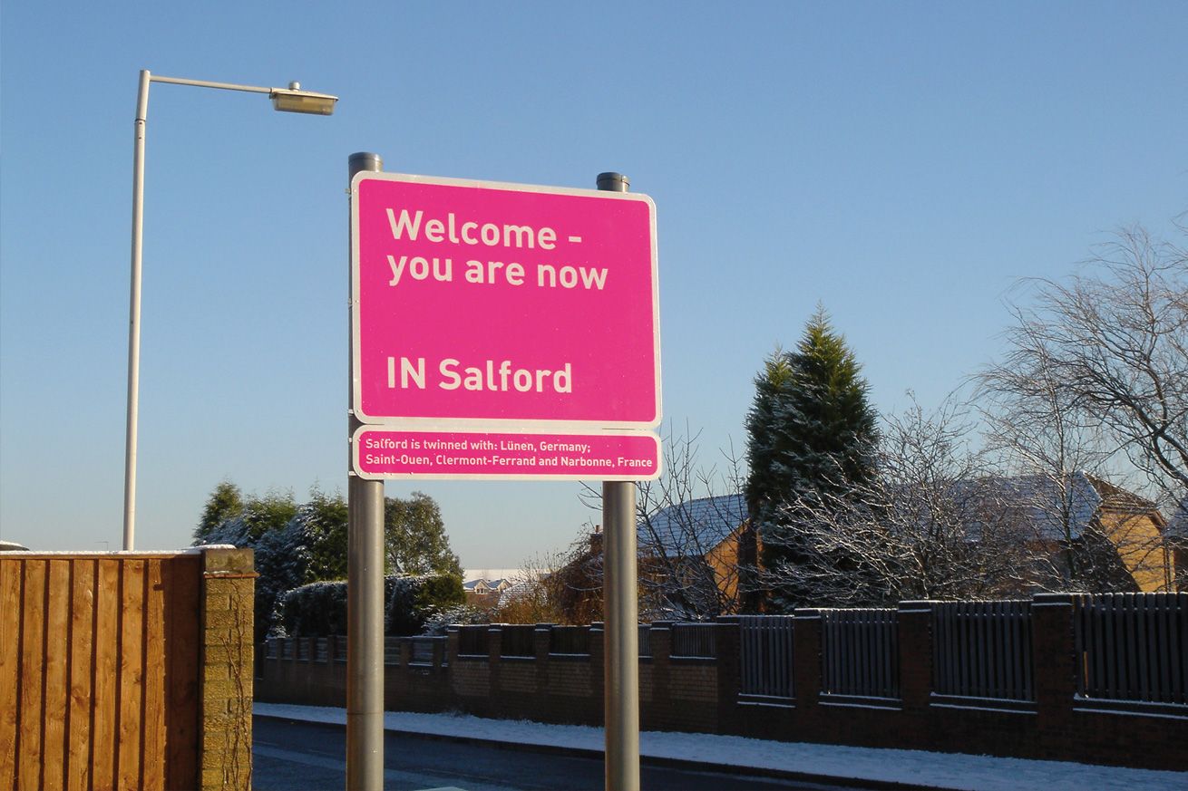
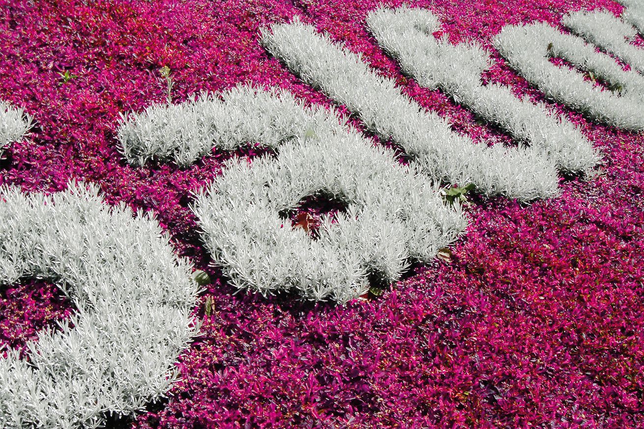
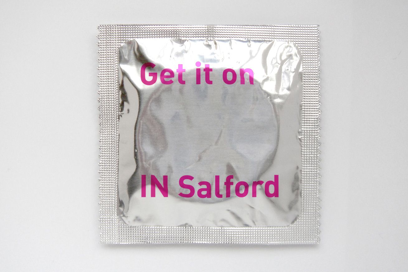
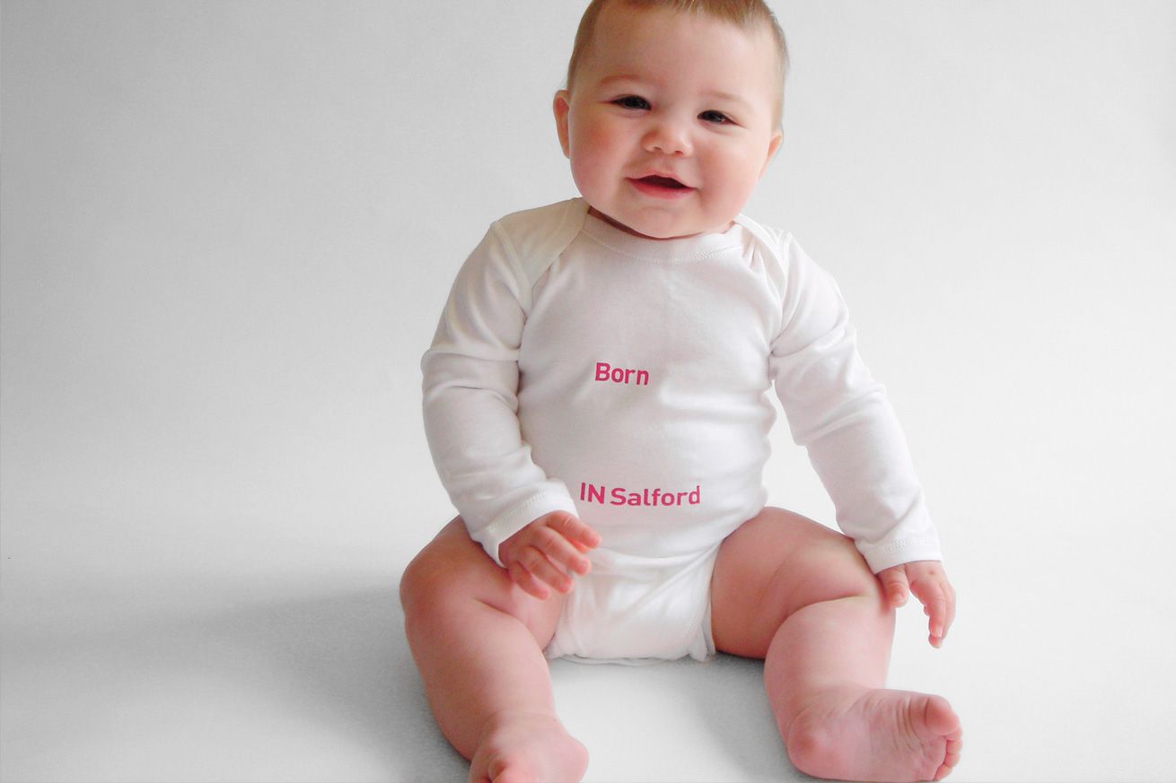
Implementation has ranged from a complete overhaul of the City Council’s printed materials and website, to vehicle livery, staff uniforms, signage, wheely bins, Magenta Town Hall Christmas lights, University flowerbeds, World Aids Day condoms and Hospital shop baby-grows.
–
Featured in MOMA Exhibition, New York

A Best Awards Winner.
